How to Mix and Match Tile Colors Like a Pro

Want to try a colourful design scheme, but not sure where to start?
Mixing and matching tile colors isn’t rocket science it’s a system.
Nail the fundamentals, and you’ll transform any room from “meh” to “wow” without second-guessing your choices.
No more random swatches on the floor; you’re about to get surgical with color. Let’s dive in.

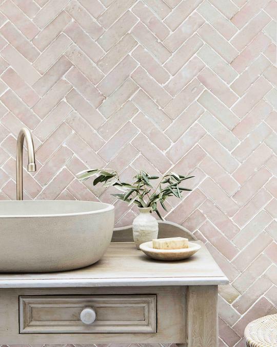
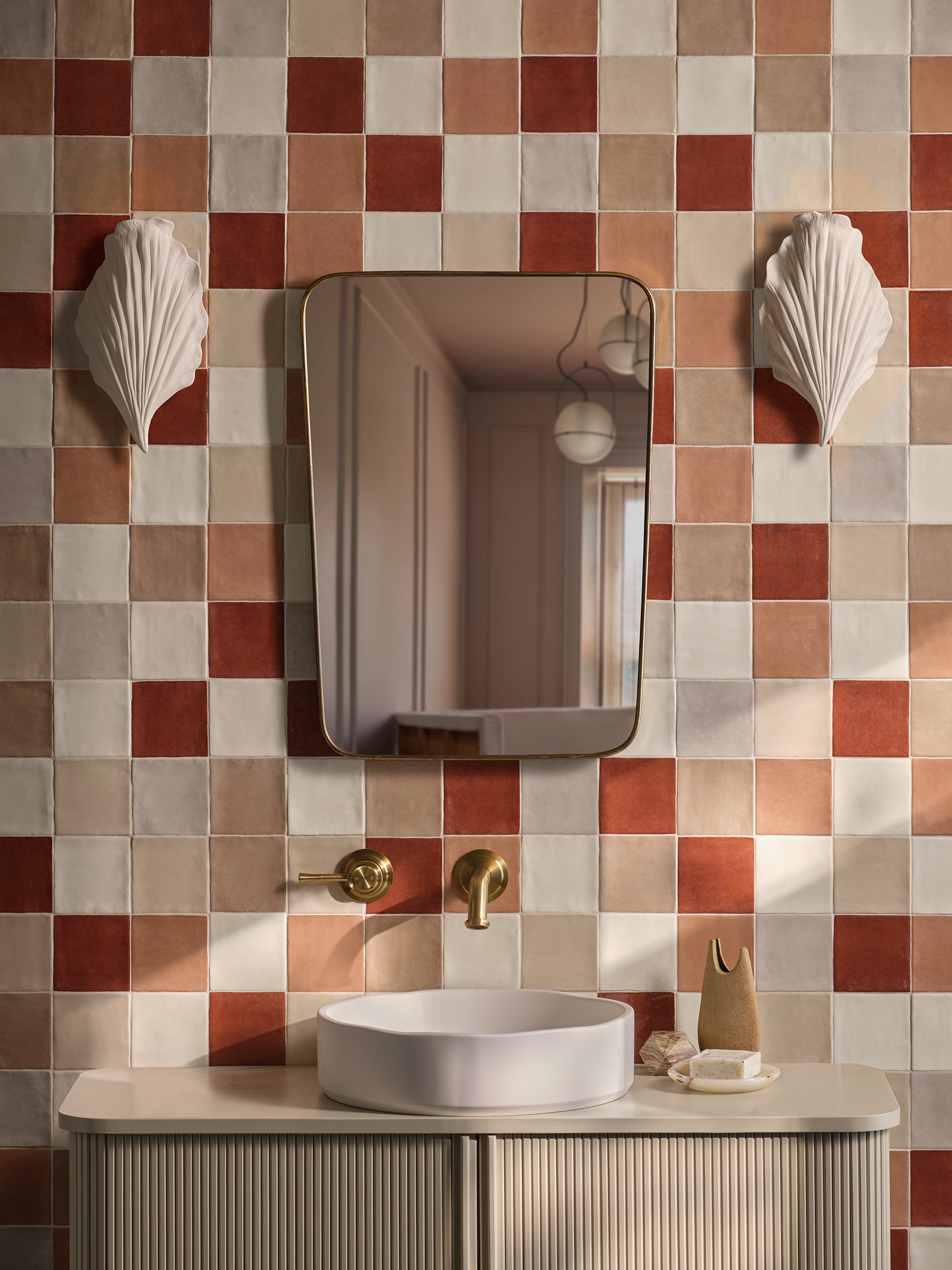
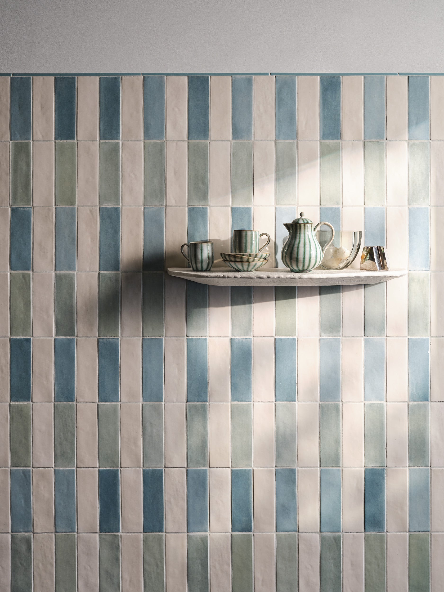
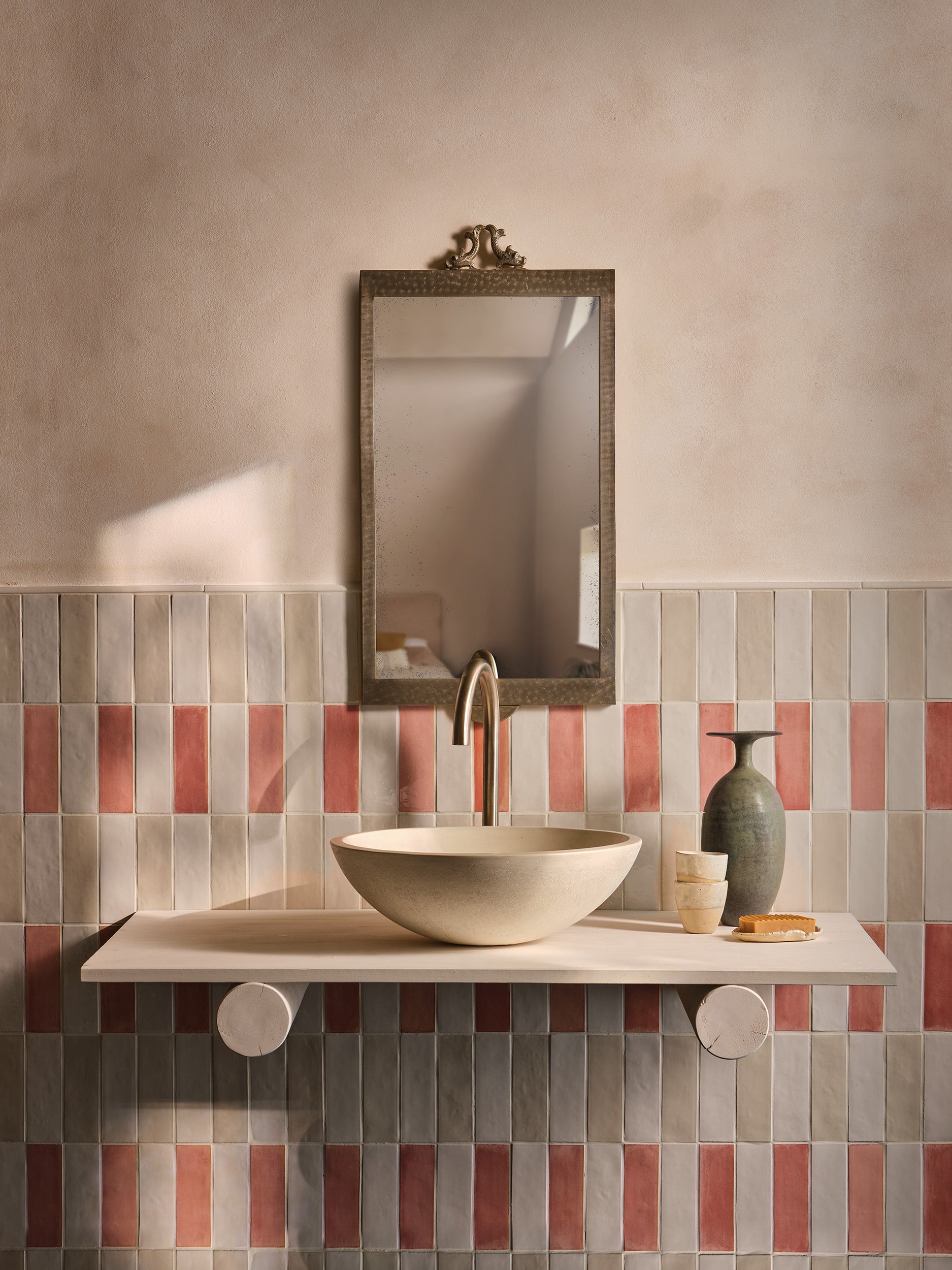
1. Understanding Color Temperature (Warm vs. Cool)
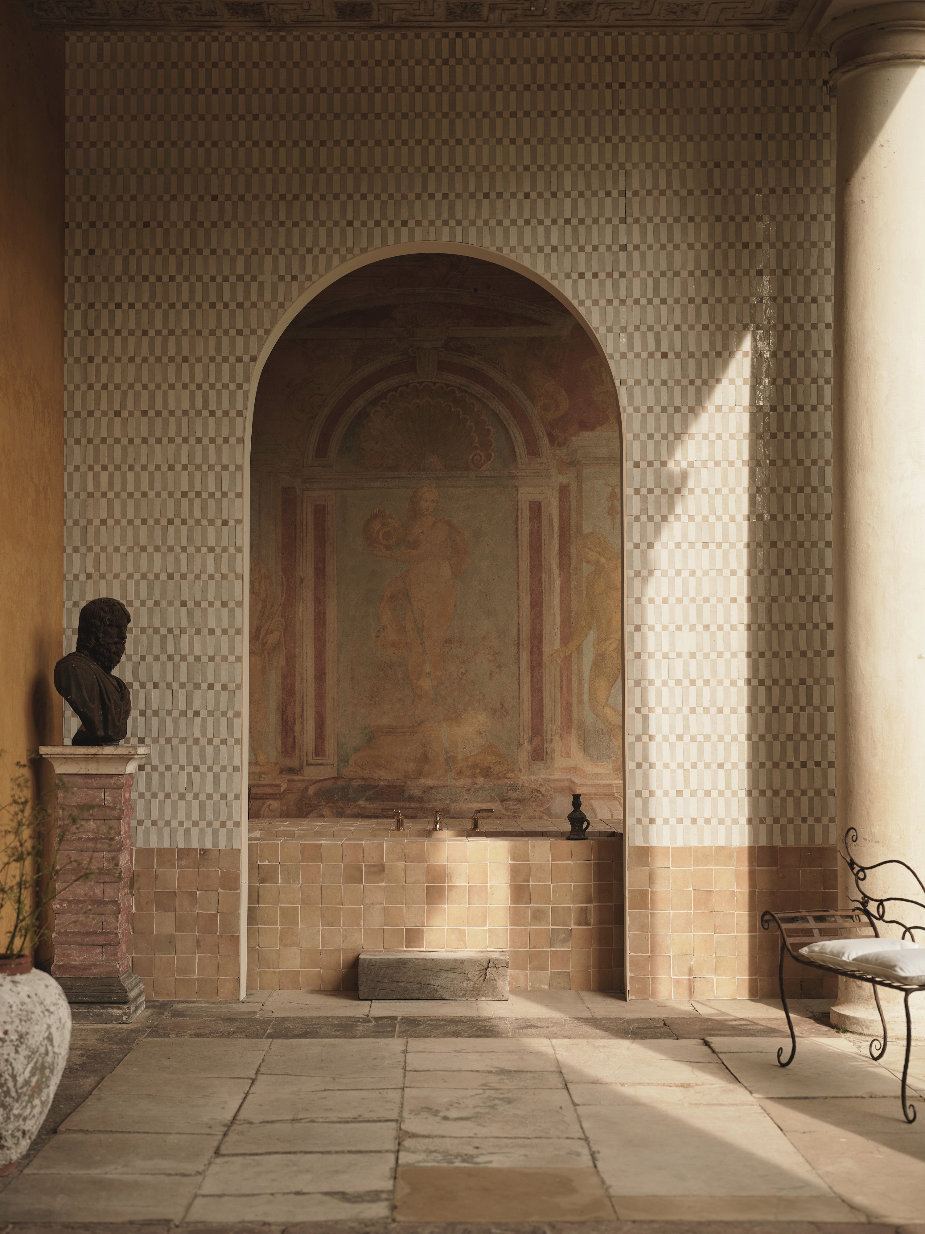
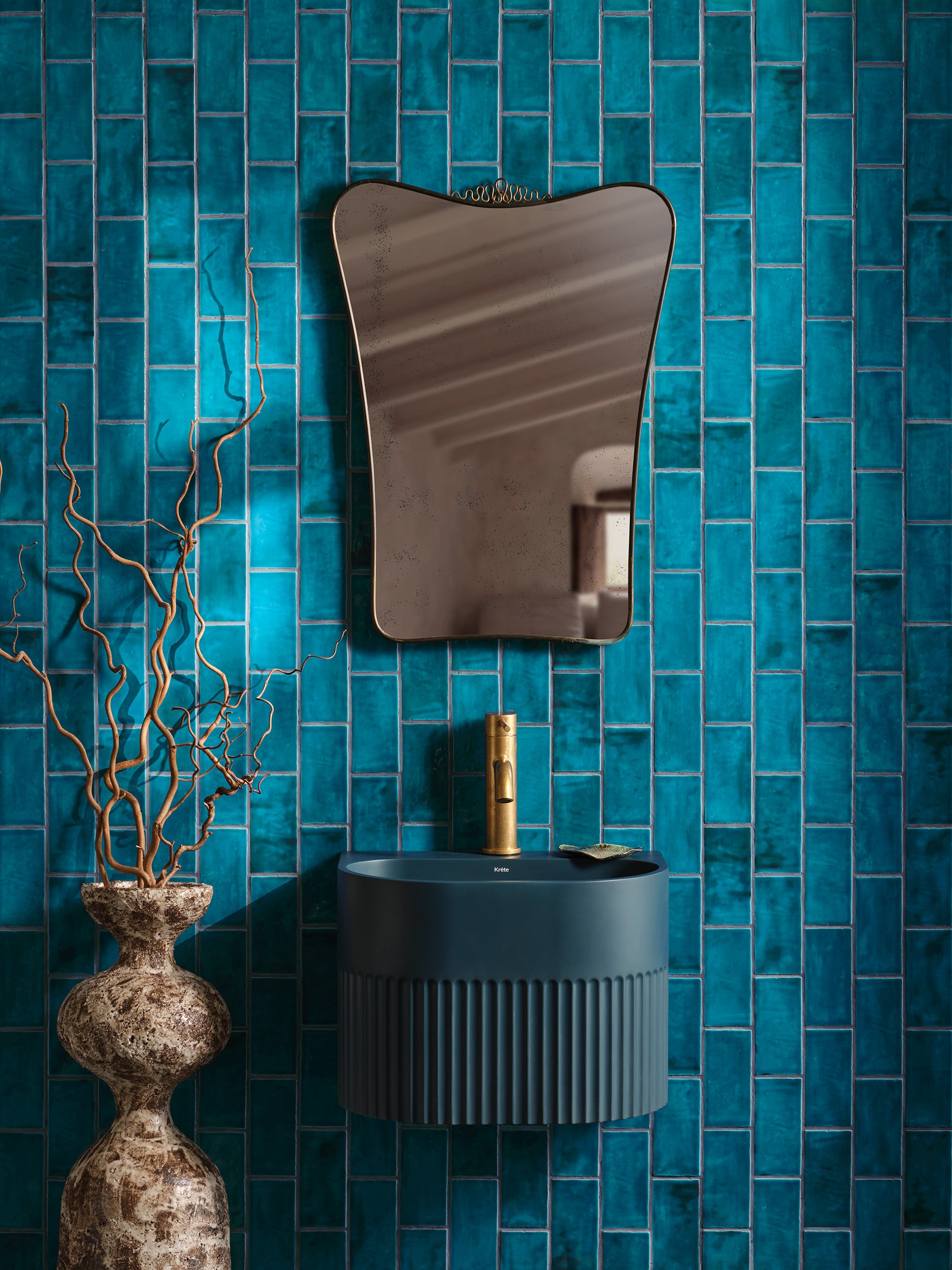
Stop guessing. Warm colors (reds, oranges, yellows) scream energy; cool colors (blues, greens, purples) whisper calm. If you pair warm on warm or cool on cool, you get harmony—think sunset kitchens or spa-like bathrooms. But cross that line and you risk chaos. A single cool accent in a sea of warm tiles gives relief. Reverse it for drama. Know your temperature and own the vibe.
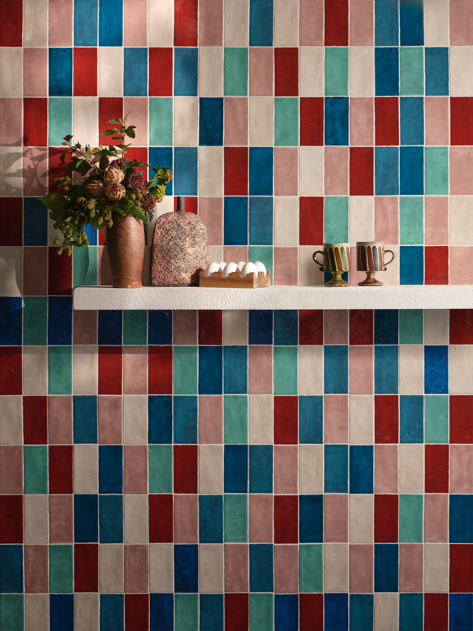
2. The 60–30–10 Rule in Tile Design
This isn’t interior design 101 fluff—it’s math that works.
-
60% Base Color: Your wall or floor’s dominant tile.
-
30% Secondary Color: Cabinets, counters, or large accent areas.
-
10% Pop Color: A single row of mosaic or a bold patterned tile.
Stick to it. Your space will feel balanced without thinking—you just applied a pro formula.
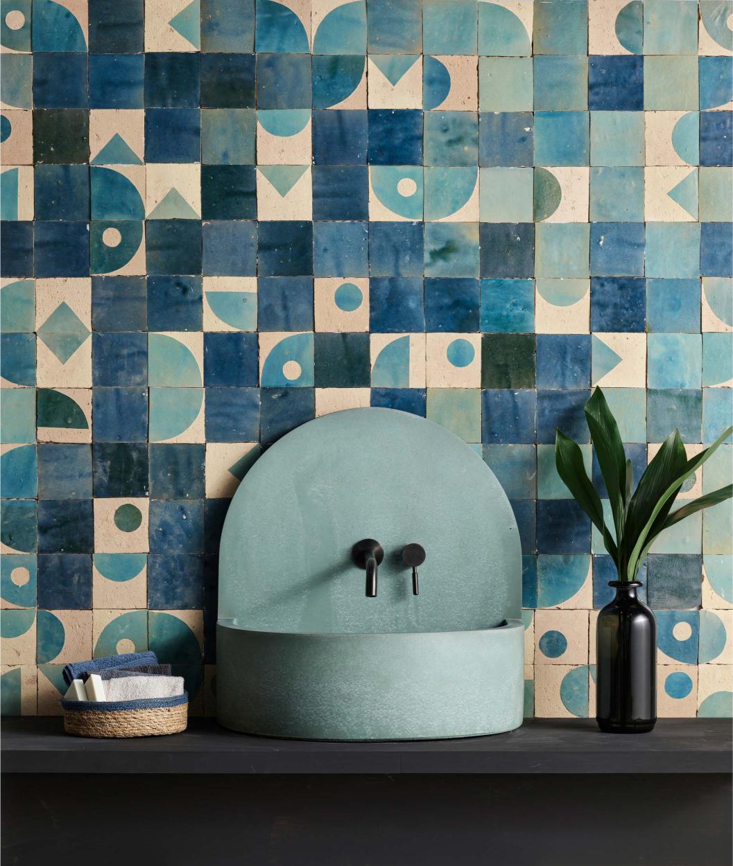
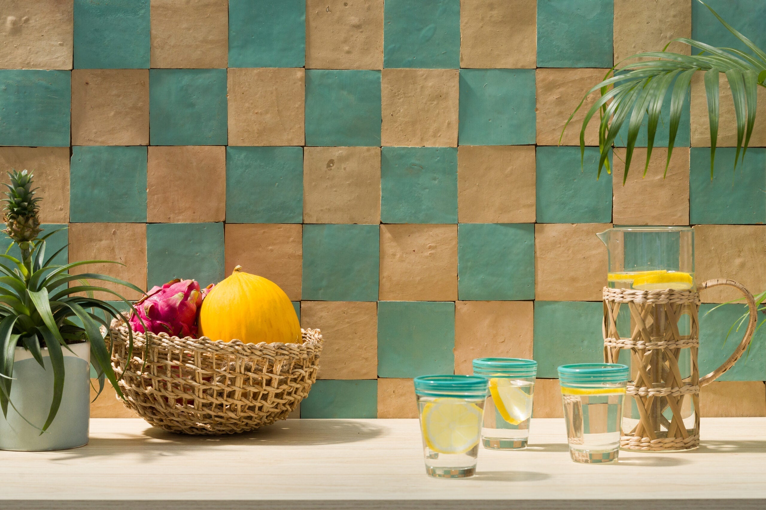
3. Complementary vs. Analogous Color Schemes
-
Complementary: Opposites on the wheel (blue + orange). High contrast, instant pop. Great for backsplashes or feature walls.
-
Analogous: Neighbors on the wheel (blue + teal + green). Subtle flow, soothing transitions. Ideal for full-room tiling where you want a gradient effect.
Want energy? Go complementary. Want serenity? Go analogous.
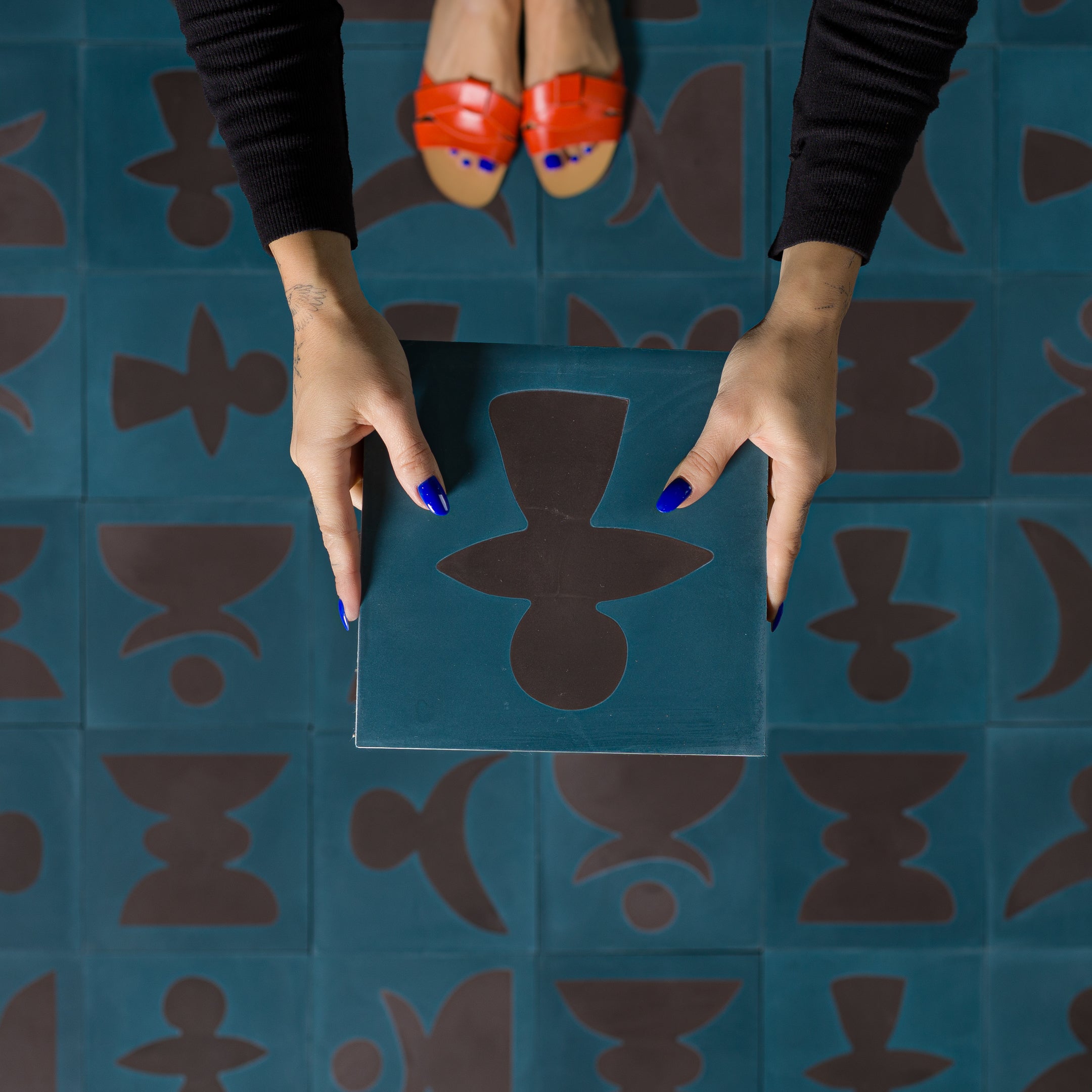
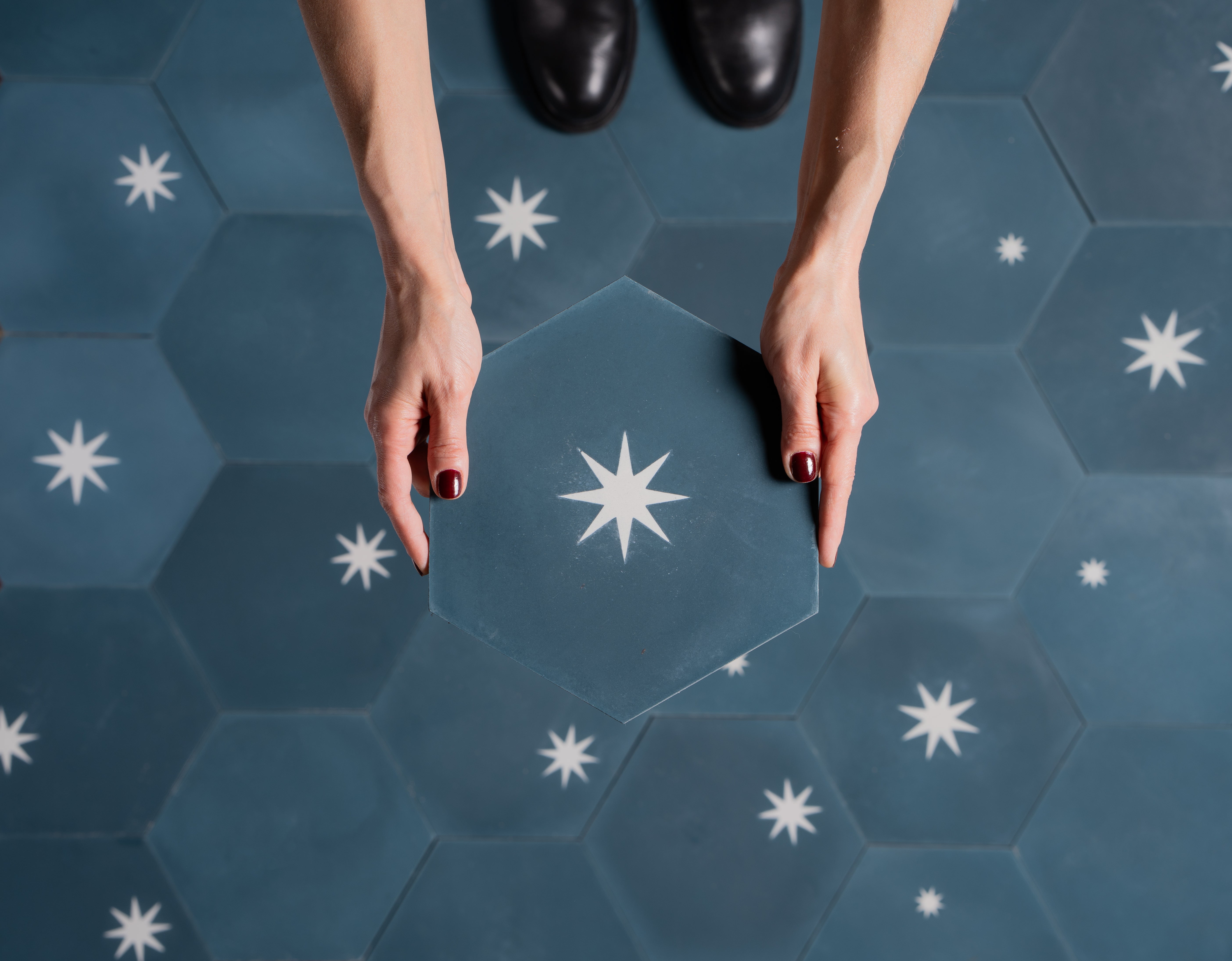
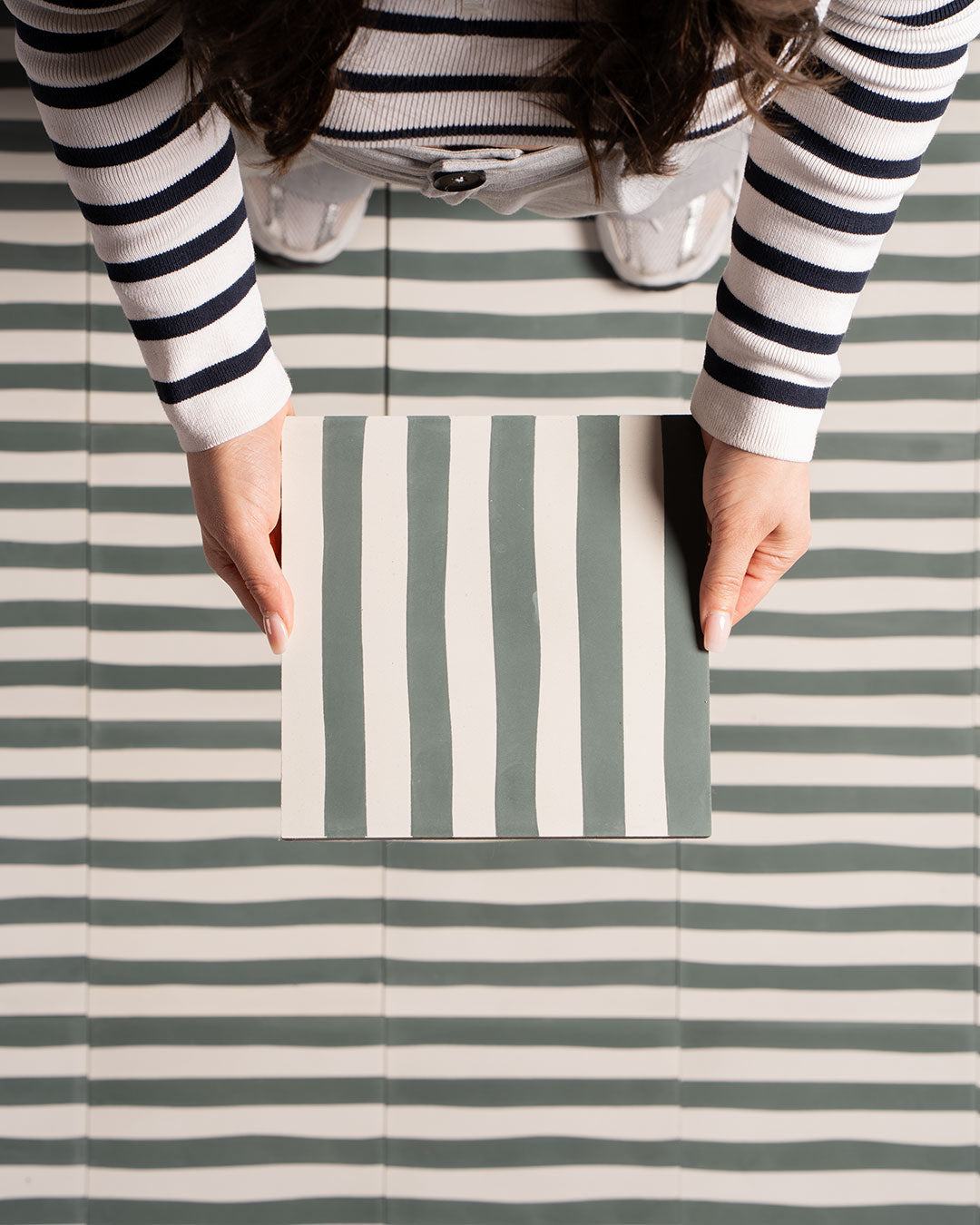
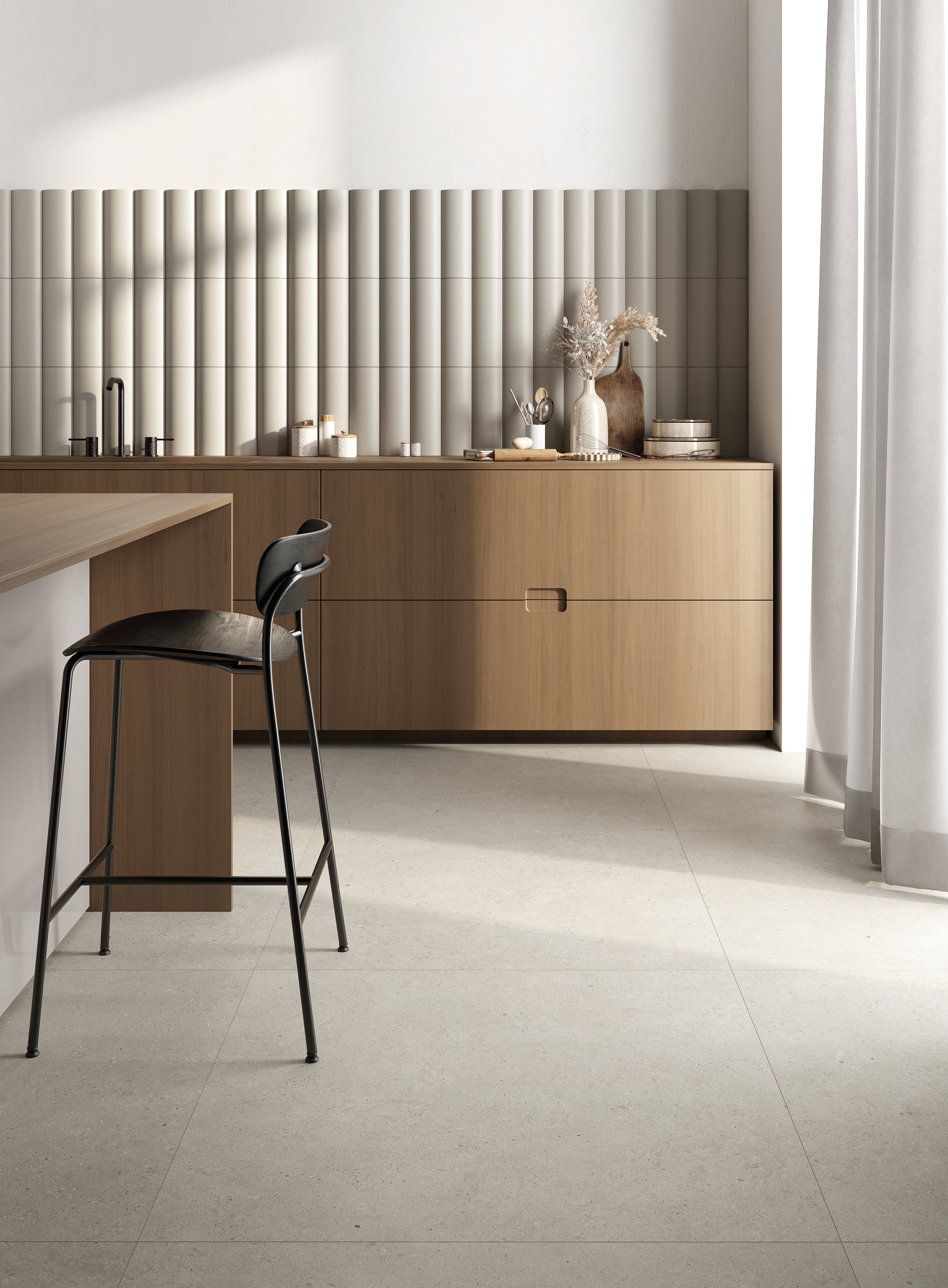
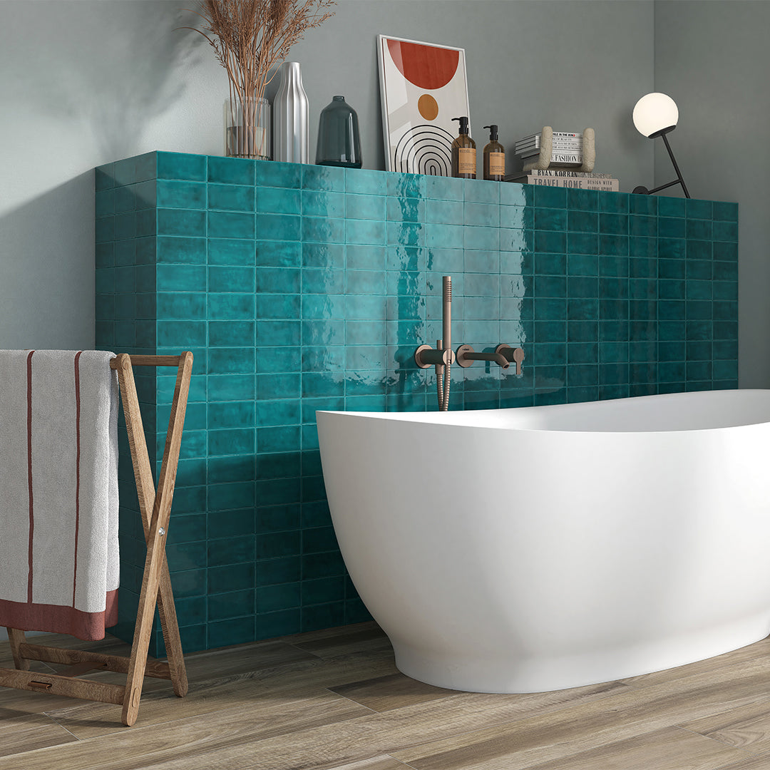
4. Using Accent Tiles to Create Focal Points
Accent tiles aren’t decoration—they’re anchors. A single vertical stripe next to a vanity, a framed inset in the shower, a contrasting border on the floor. Place them where you want the eye to land: above a sink, behind a range, at the foot of the tub. Don’t scatter accents; strategically deploy them.
5. Tools & Apps for Visualizing Color Combos
Stop printing samples and tap your phone:
-
Pinterest Mood Boards: Pin real-room shots.
-
Sherwin-Williams ColorSnap®: Upload a photo, swap tile hues.
-
Morpholio Board: Drag & drop tile swatches over your walls.
Test combos in seconds. Save hours avoid “What if” regret.
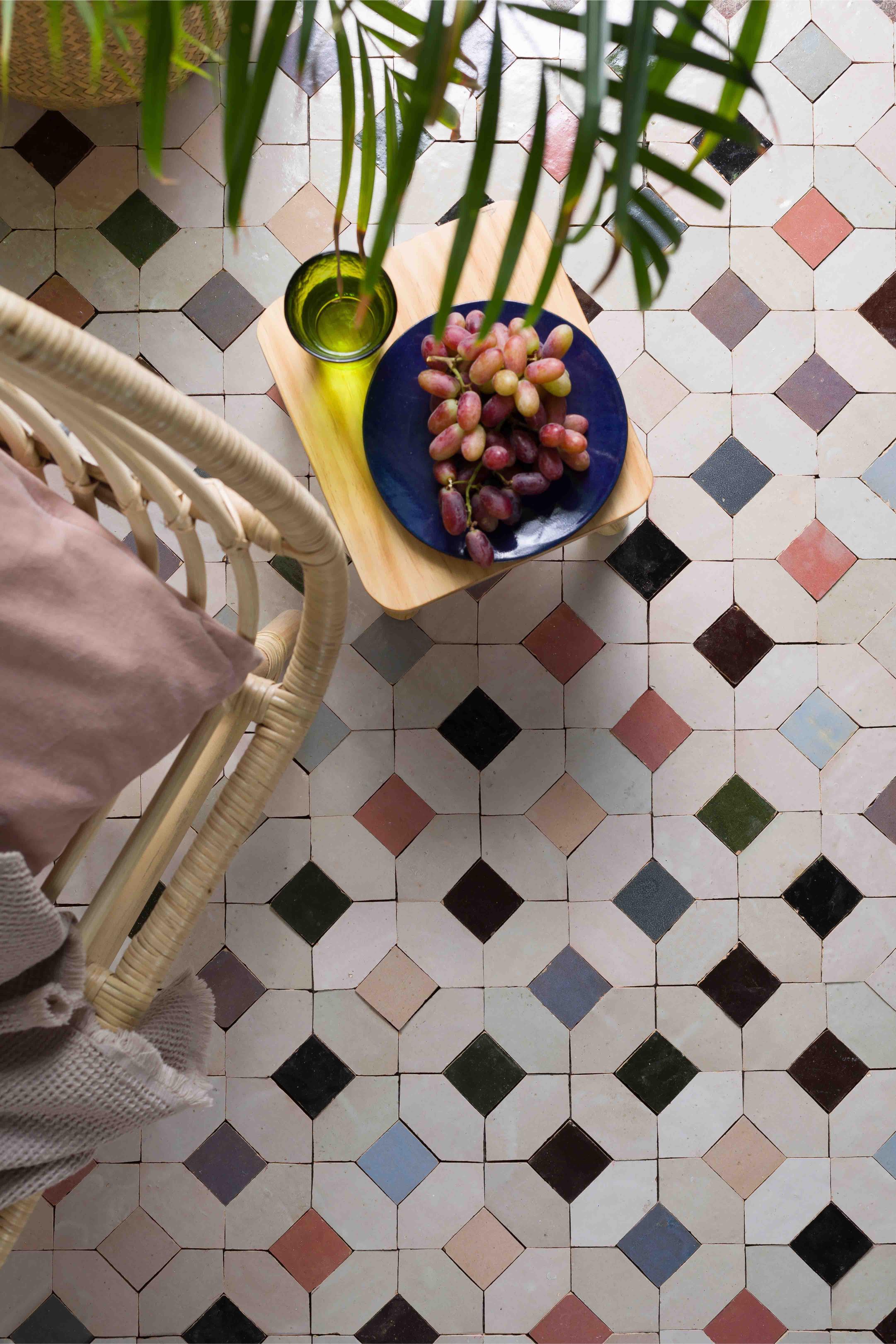
6. Expert Tips to Avoid Clashing Hues
-
Limit your palette: More than three tile colors? You’ll overwhelm.
-
Check natural light: A swatch that pops under showroom lights might dull in your dim hallway.
-
Use neutrals as buffers: White, gray or beige grout can tame wild tiles.
-
Sample at scale: A 4×4″ chip won’t reveal pattern impact. Always do a larger mock-up.
Nail these, and you’ll mix like a master, not a novice.

