A.Naber Design
Founded by Abbie Naber, A.Naber Design utilizes Abbie's fashion background and eye for detail to build artful, tactile spaces. For this beach house project Abbie talks us through the concept, color and materials of this joyful design scheme.
Firstly, what was the concept for the overall design scheme?
"For this project, we focused primarily on having fun, which is such a refreshing place to start. Being that the project is a second home/ vacation home for this family, we had a bit more free reign in terms of color combinations and material choices. While durability and longevity are always a focus for us, it wasn’t the primary necessity. We were able to take more risks with tile applications and use of color. "

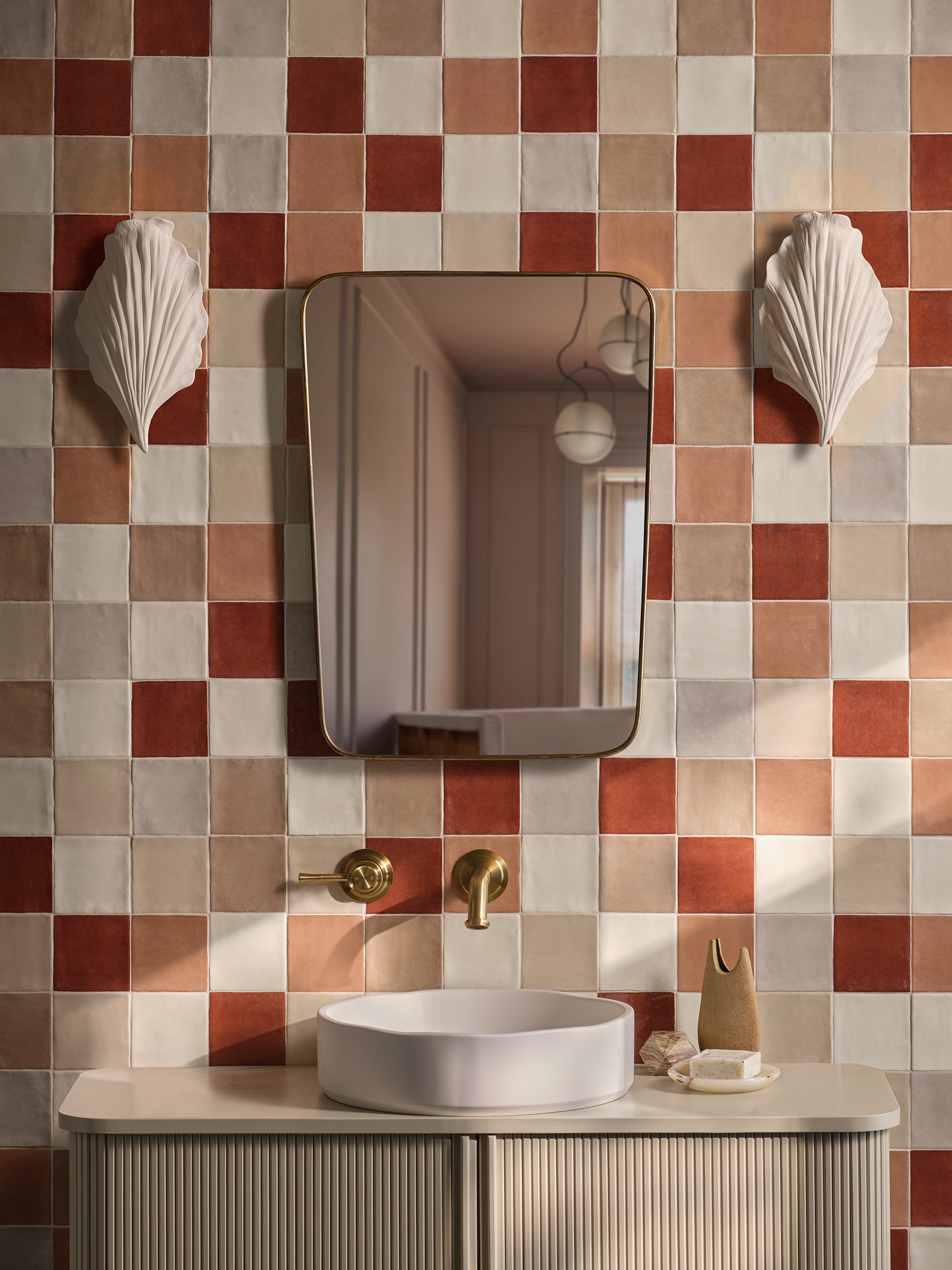
The first thing that hits me in this project is the strong colour. Particularly the deep ochre and terracotta tones. Could you talk us through the colour palette inspiration, and how you create balance?
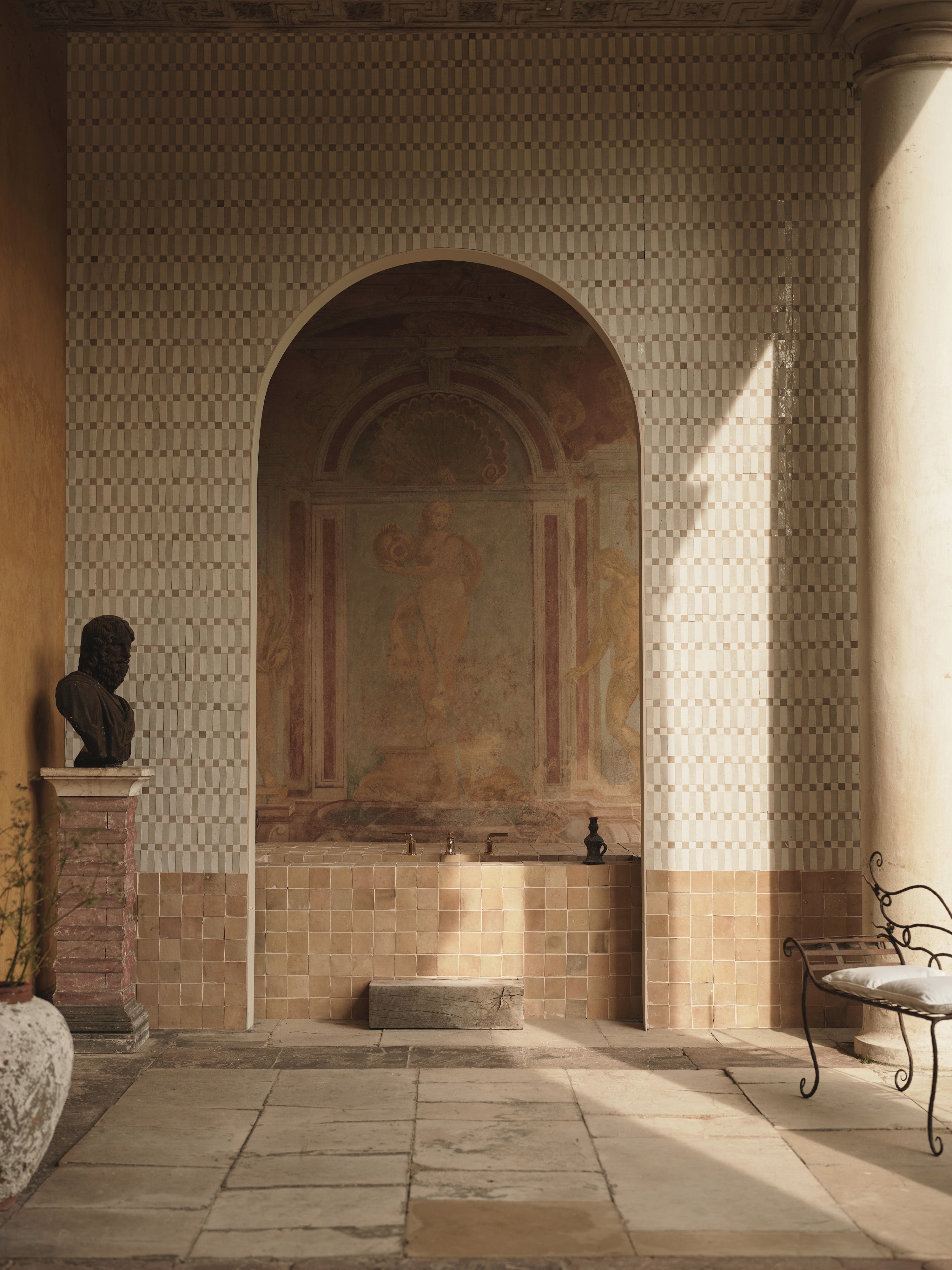
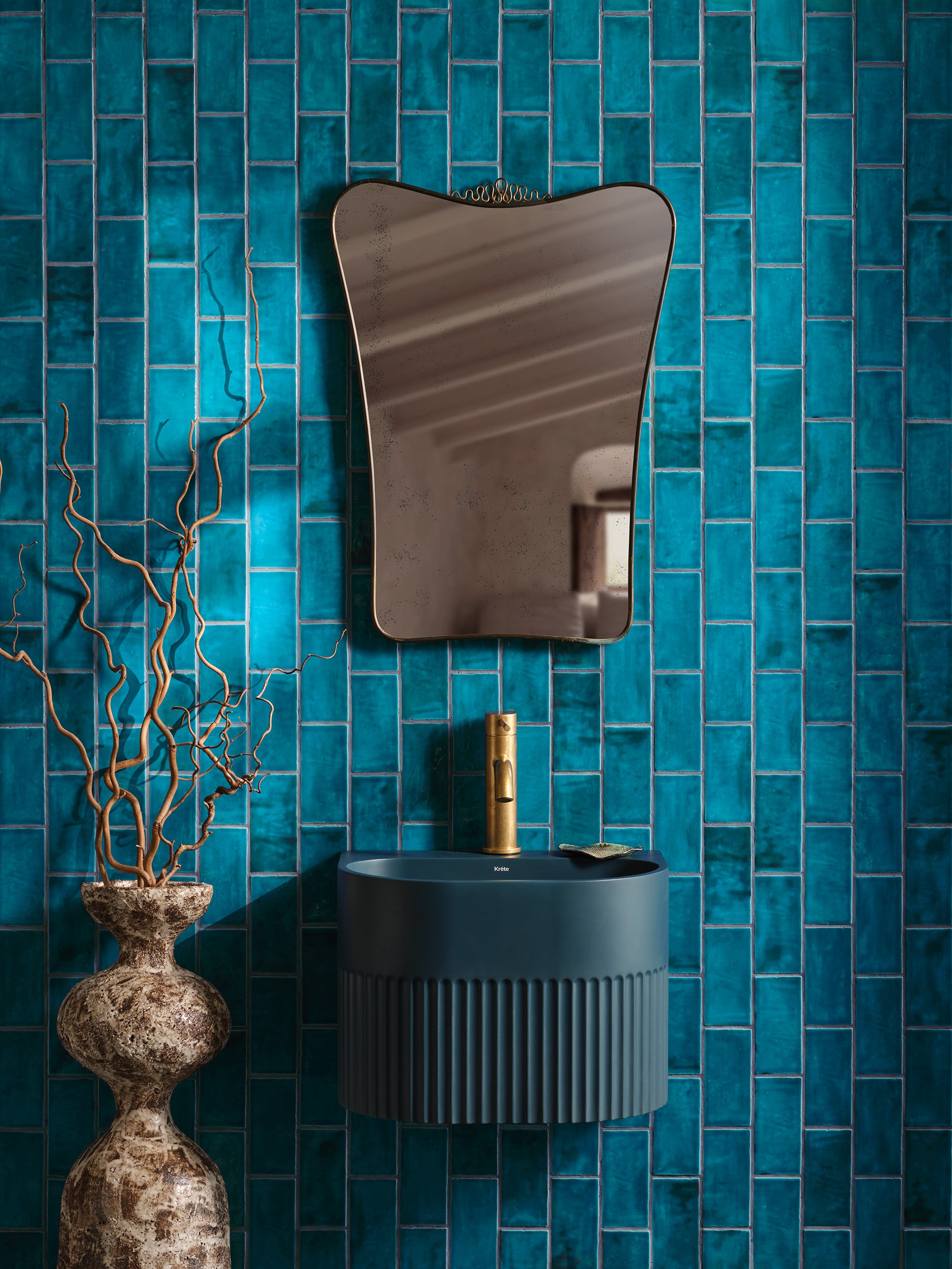
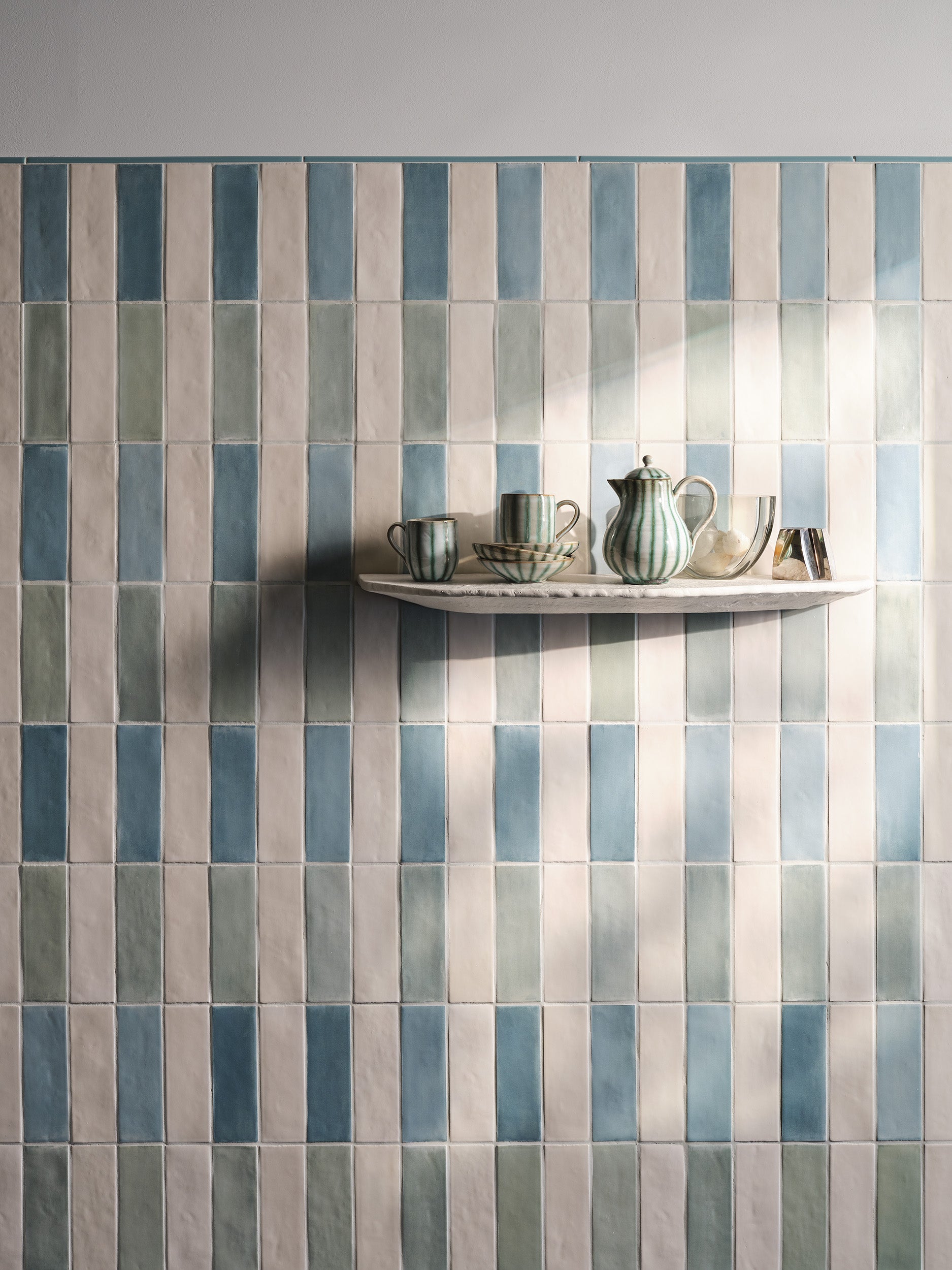
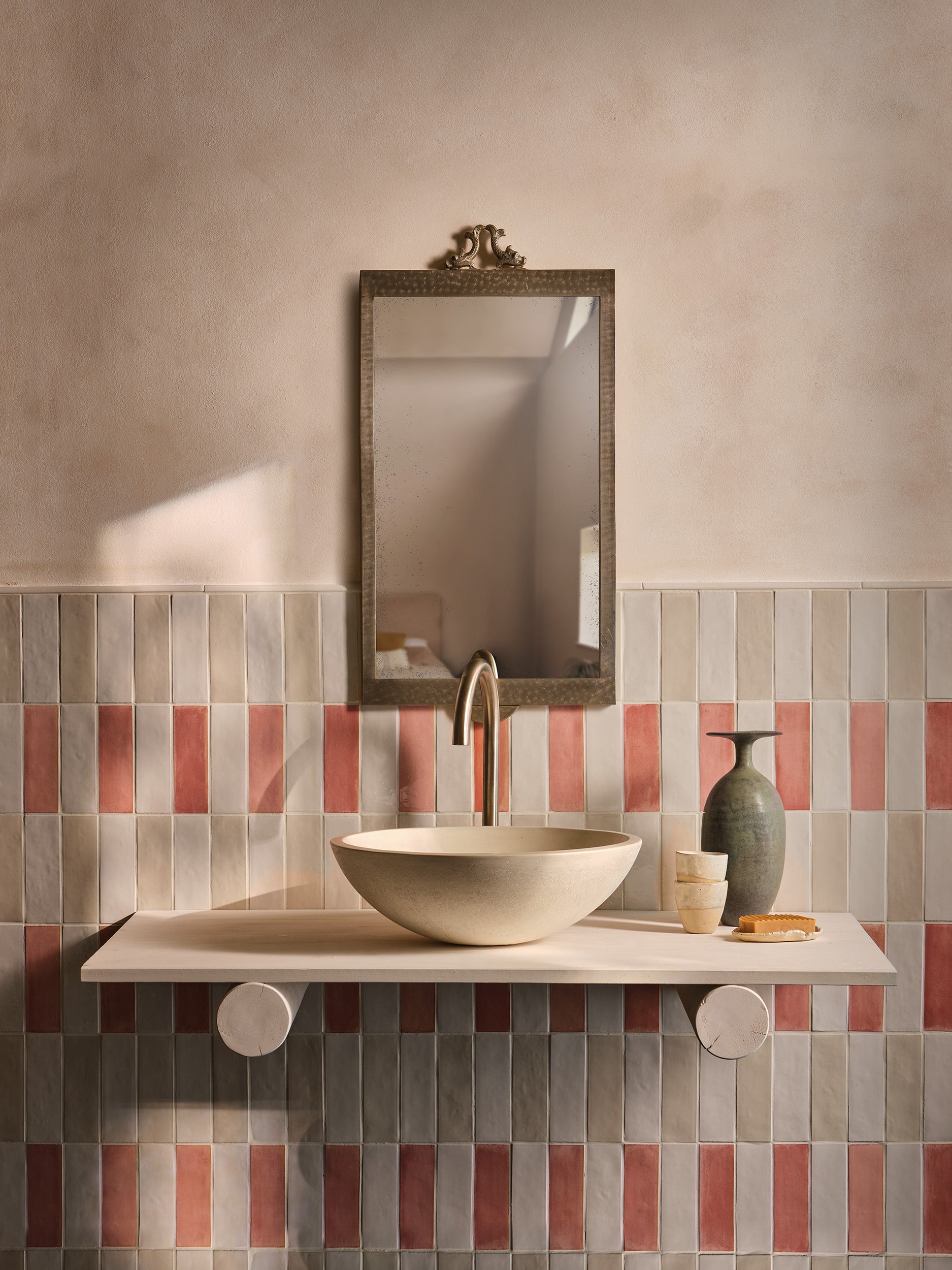
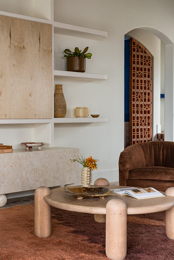
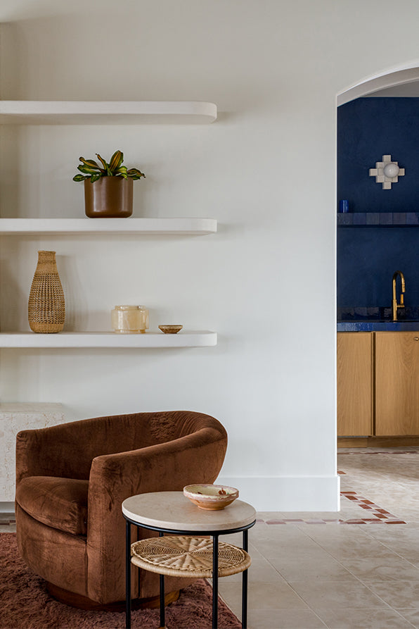
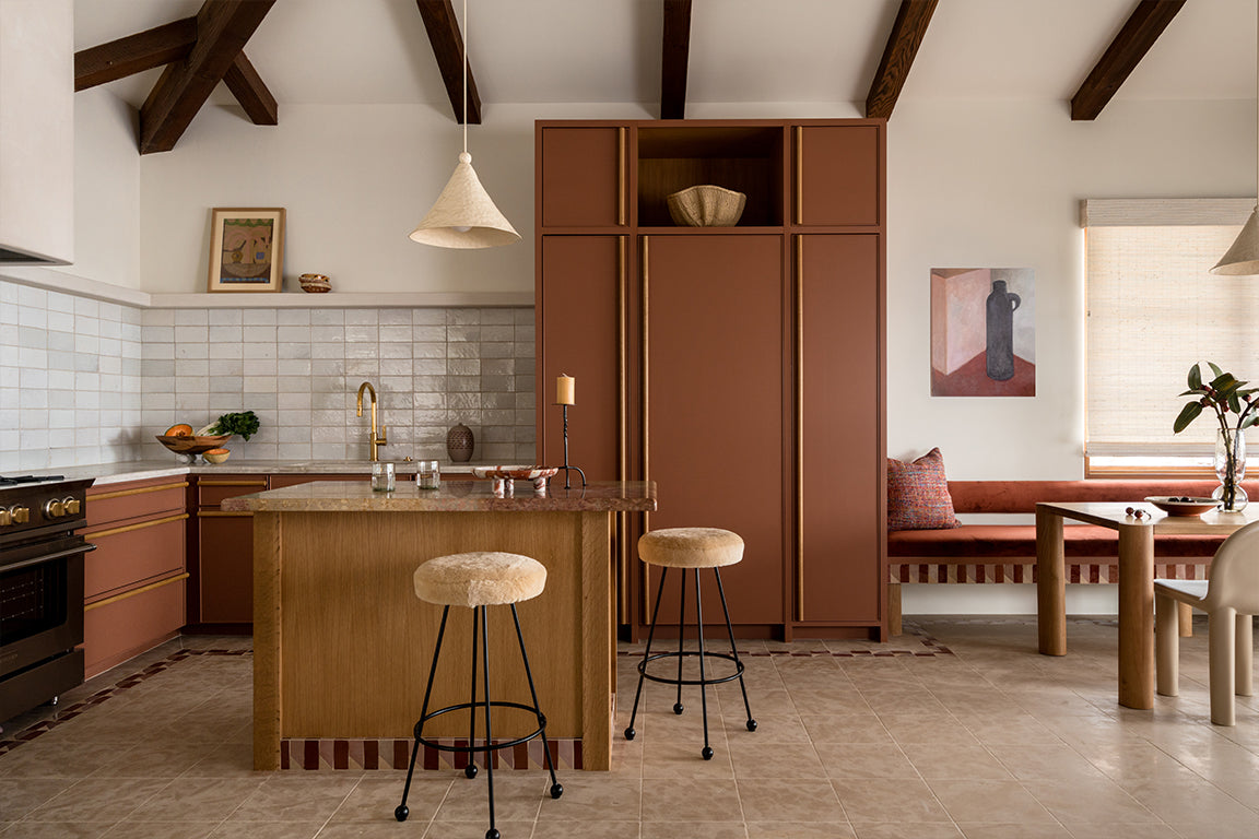
"Our client is an artist and really valued strong use of color. The prevalent themes during our exploratory phase were the use of terracotta and cobalt blue- both influences from Mexican surf getaways and haciendas. The natural hue of breezeblock was also a strong influence in our palette from early on in concepting. While there is strong use of color in certain areas, we pulled back in others and utilized a warmer white wall to allow vintage pieces to dance and stand out a bit more. There is a vein of color that runs intently through each space. The kitchen, for instance, boasts a strong terracotta hue, and the inlaid tile border runs from that room through the perimeter of the living area- tying the two spaces together. The rug connects with the tile, and so on and so on. You’ll see the pairing of the terracotta and the cobalt blue in the bar area which allows the cobalt to pair back to the kitchen. Where areas with white walls create a bit of breathing room, there is intention in the soft furnishing palette."
The space seems to have a vibrant personality, while giving a sense of calm. Can you share some insight into the mood you wanted to create within the home, did material choices, textures or surface quality affect this?
"Honestly, we weren’t going for much calmness here! The goal was an eclectic, one-of-a-kind space layered with color, tile, pattern, and vintage touches. The inspiration was a Mexican surf-inspired getaway for this avid surf loving family. We wanted the space to feel lived in, relaxed and truly special. Nothing is too precious and the homes purpose is to welcome guests to settle in and relax.color in certain areas, we pulled back in others and utilized a warmer white wall to allow vintage pieces to dance and stand out a bit more. There is a vein of color that runs intently through each space. The kitchen, for instance, boasts a strong terracotta hue, and the inlaid tile border runs from that room through the perimeter of the living area- tying the two spaces together. The rug connects with the tile, and so on and so on. You’ll see the pairing of the terracotta and the cobalt blue in the bar area which allows the cobalt to pair back to the kitchen. Where areas with white walls create a bit of breathing room, there is intention in the soft furnishing palette."
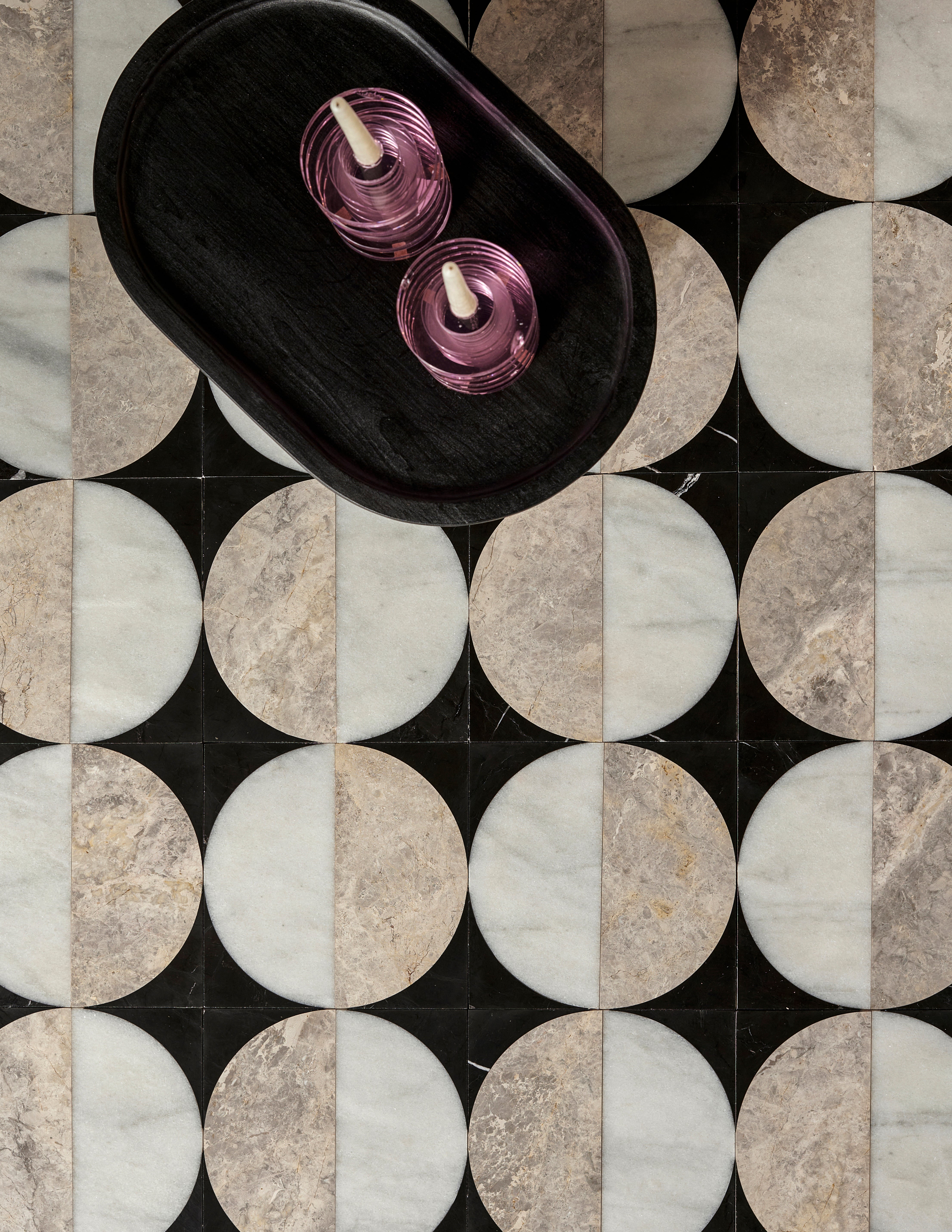
What role did pattern and details play within the home?
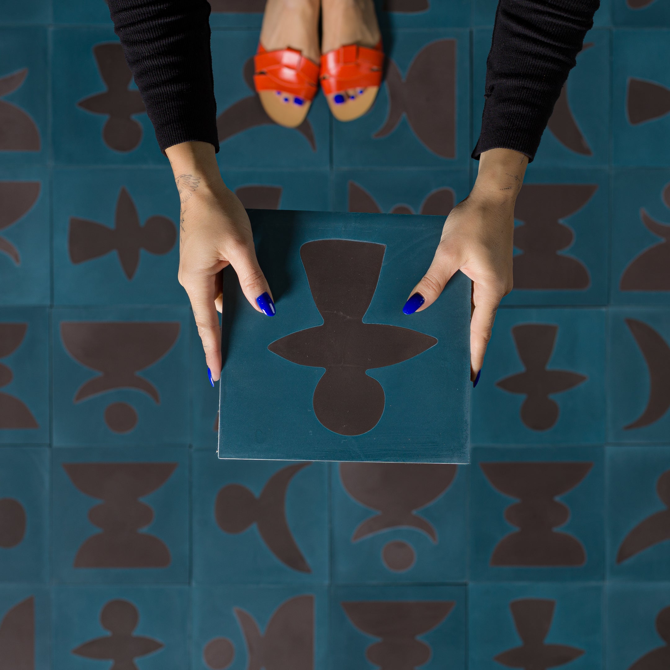
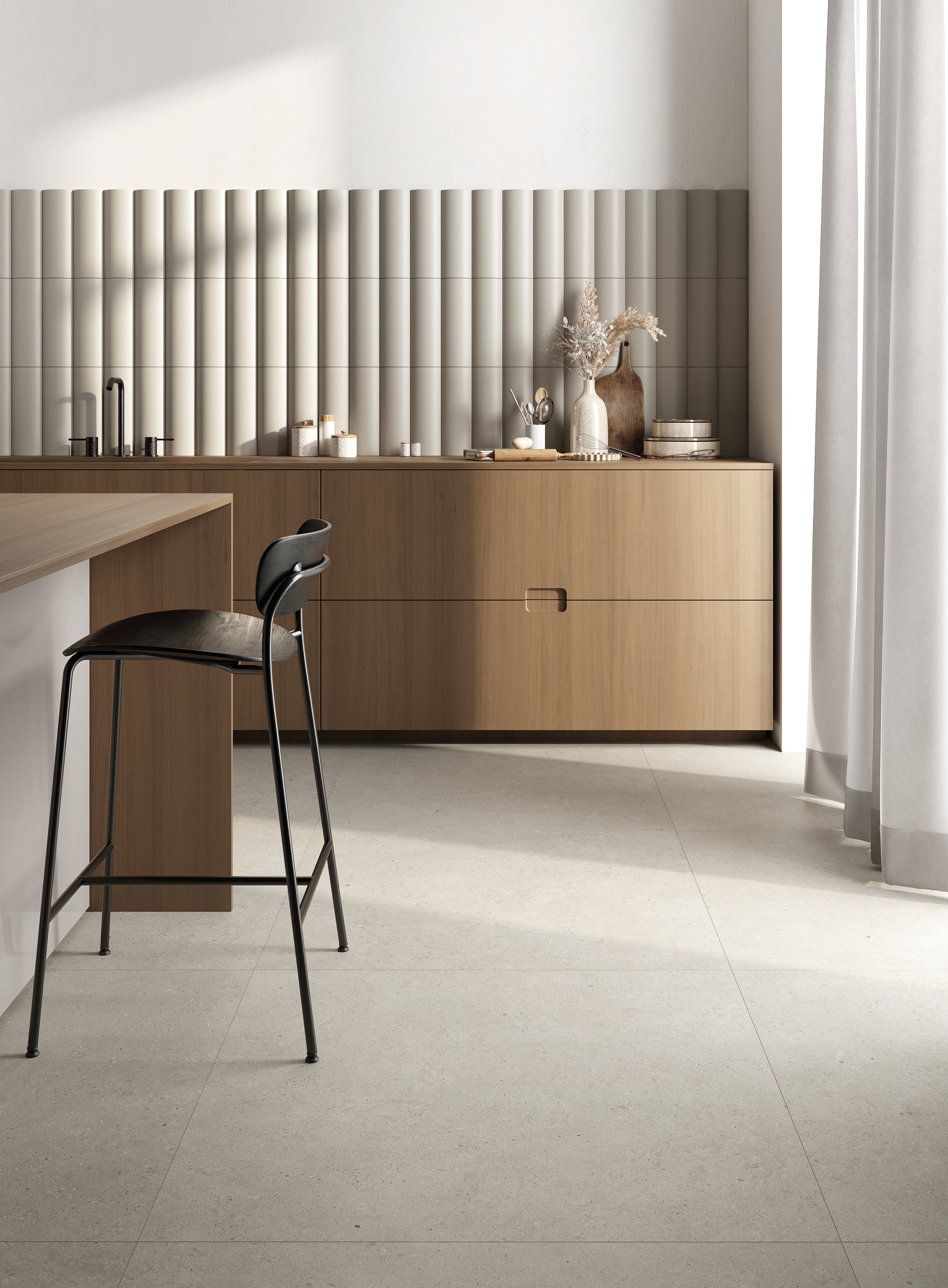
"Pattern has its place in this project and you can see that in a few areas- the kitchen tile border, the striped tiles in the casita kitchen, and of course the arched zellige tiled shower. They say the devil is in the details, and I truly feel that way when designing a project. This could be smaller details like countertop edging or larger, more visible details like these wood handles on the kitchen cabinetry. Taking the time to sort out the small stuff sets projects apart from each other. That is always a priority of mine."
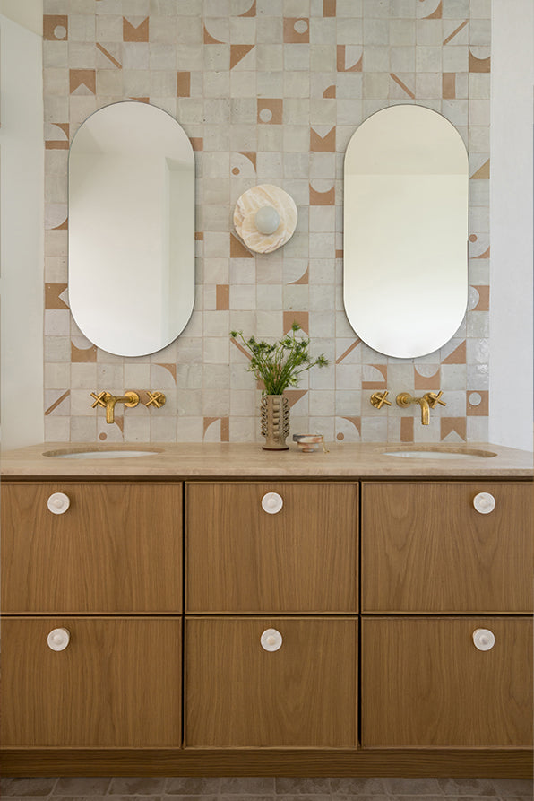
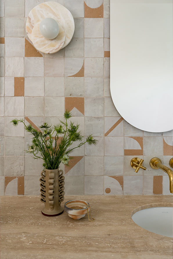
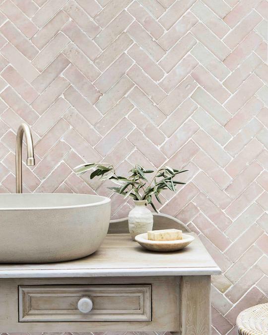
Now, let's talk about tiles! The White Patten Zellige tiles behind the vanity unit add a wonderful inclusion of contemporary handcraft whilst also complimenting the modern design style. Could you tell us how you pulled the elements together to create a balanced look?
"For this space, it was a balance between wanting a calm, understated space while mixing in some playfulness. We kept the palette simple- off white and oak and we kept the surrounding materials subdued in using travertine and plaster. That allowed for a bit more play a focus on the tile without overpowering the bathroom."
Was symmetry and asymmetry a consideration for putting together the tile pattern with the other elements of the vanity?
"The vanity area is pretty symmetrical in that we chose double sinks, double mirrors, and a single sconce. That allowed the asymmetry of the randomized tile pattern to create some tension and opposition."
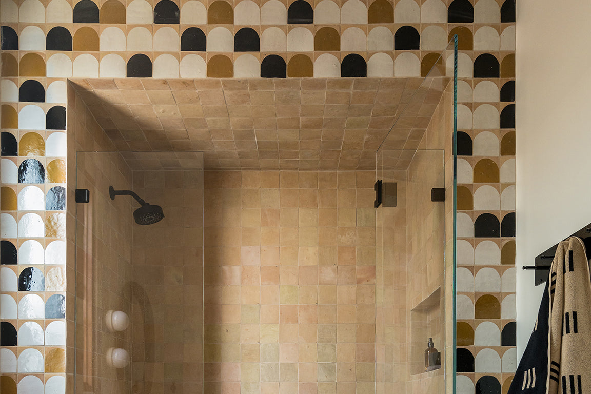
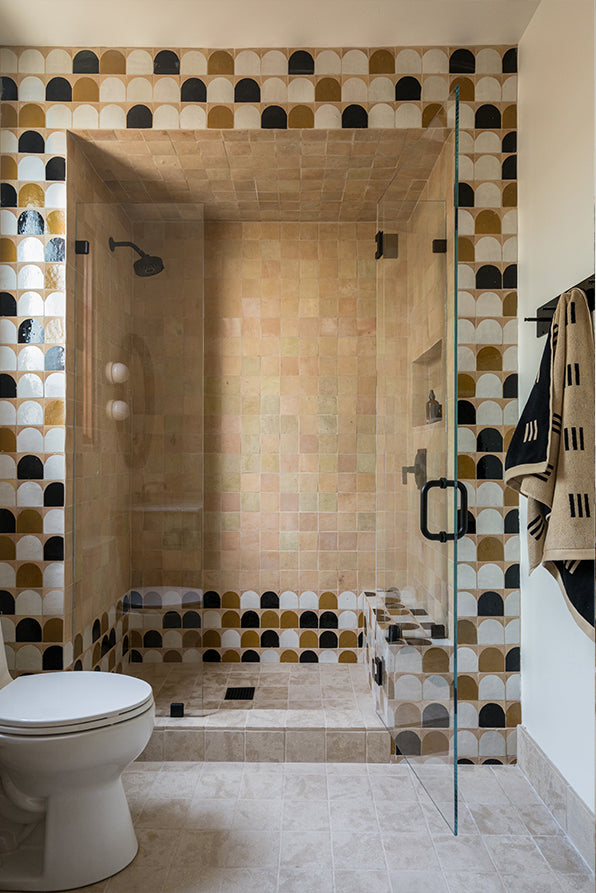
The shower room you created in this project is simply incredible. What role do the patterned tiles play in the overall composition of the room?
"As mentioned above, pulling materials back in other areas (the plaster walls, the simple travertine, counters, and the limestone flooring allowed the patterned tile to contrast and standout. I think it created just the right balance in the space."
How do you think the choice of Amber Arch Terracotta Zellige, White Arch Terracotta Zellige, Black Arch Terracotta Zellige and Terracotta Zellige tiles affects the feel of the space, and connects to the aesthetic of the overall scheme?
"The tones chosen for this room were driven by the fact that we were accommodating a teenage boy. So, I believe that the hues lean a bit more masculine in this room. It’s not necessarily a palette that you see repeated in the project, but the use of patterned tiles does repeat itself a few times and connects back with intention to other rooms."

NEWSLETTER
Subscribe to our newsletter to get inspired and catch the latest trends in tile design